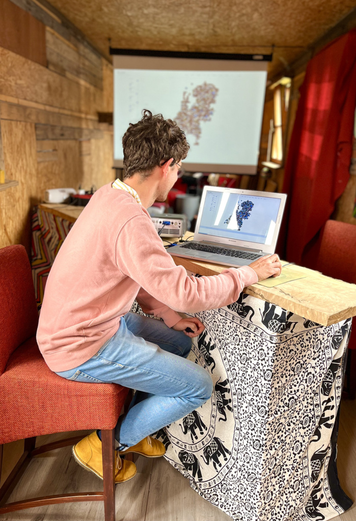
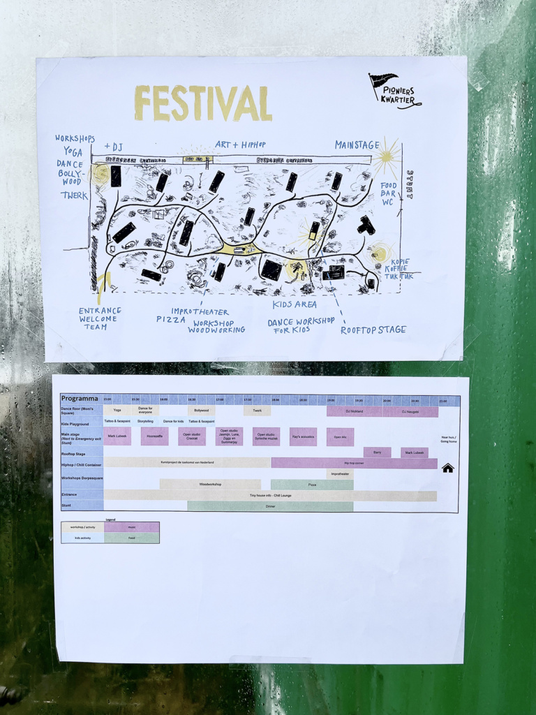
Went to Delft last Saturday to participate in a festival at Pionierskwartier, where a family member lives in a tiny house – very nice and cozy. Wwere amazed at the progress that was made turning this industrial site into an eco-friendly place where sustainable living is experimented with.
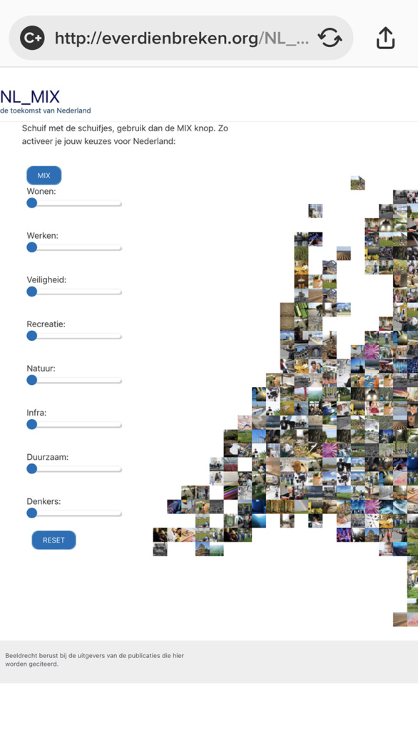
Anyways, they invited me to be part of the festival, and I gladly accepted the opportunity to show NL_MIX [read here, play here]. Lots of people came & used the app to create their own future-of-the-Netherlands, and I learned a lot about how the app could be bettered.
To do:
add a > and < near the sliders so it is more obvious what they are for
make the big ‘mix’ button stable size, it moves suddenly which makes users wary
keep the choices made on the main page while browsing via the categories in the top menu or via clicking on the images, for people were totally disenchanted to have lost their choices after browsing.
For further consideration: quite a few people linked the pixels on the map to the place where they lived, and wondered what that particular pixel meant for their place of residence. Maybe I should link pixels to areas?
Later: after some furious hours of coding I’ve been able to incorporate all of the above!
The < > option became a small text above the buttons, mainly because I could not get the < > option to look good and be in the right place
. MIX button is now stable size, different color, has a little brother called RESET.
all the choices one makes on the home page via the sliders are now stored. I made a TERUG (RETURN) button to go back to this page and have ones choices (made via sliders) Still Be There! Figuring out how this could be done was most irksome. I have server-side PHP and this sends HTML to my computer, where Javascriptis employed to make the HTML do nifty things (like onclick buttons and dropdown menus). I had to figure out how to pass variables from PHP via the page’s HTML/URL to Javascript – this was not easy, it took me a lot of trial and error.
Then I got ambitious and wanted the thing to work on mobile. I’d made a simple redirect page for mobile, without the pixelated map of the Netherlands. This was just not good enough as the map turns out to be key to the whole thing. But on a small screen my map became way to small, or disappeared completely. Also the drop-down of the top navigation menu did not work.
So I did the following:
As I could not find out (and boy, did I try!) why the top nav did not work on a small screen, I did the next best thing: I made the top nav menu disappear when on mobile. As it turns out, we don’t miss it – navigating via the pixels on the map is fine for mobile. As it turns out, my theme has functionality for making navigation different on mobile, tablet and screen, brilliant!
I set a minimum size for the map – it did not immediately show up on mobile, for the sliders took pride of place on the small screen.
So I had to find a way to force a zoom-out for mobile so one sees both the sliders and map from the very start
I then unplugged the plugin that did things for mobile redirect
And voila! Better functionality for mobile!
None of the things I did were earth-shattering, it is just that I don’t do this coding often enough to become either fast or proficient.