I'm at the house of a friend in Scotland, pampering and being pampered in turn,…
I’m preparing for a new round of play-art. Next saturday will see me and Eveline in the Hague, scattering opportunities for play in the path of unsuspecting passers-by. Back to the idea of play-in-public-space – getting adults to step out of/in/over/away from/on/inbetween the everyday. Pockets of play in an ocean of predictability.
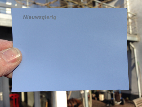
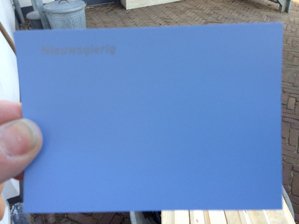
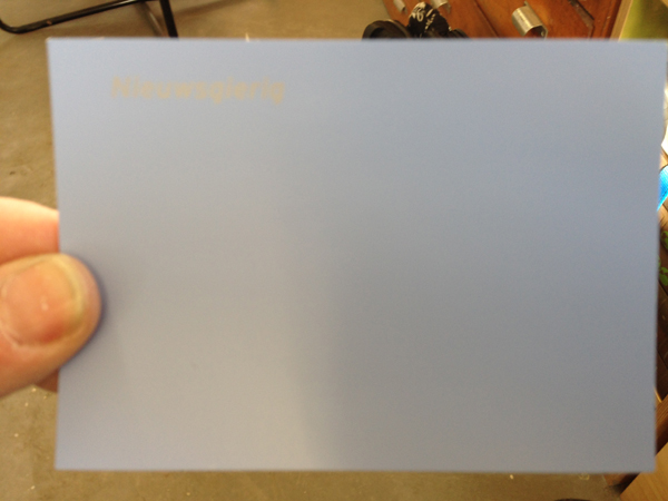
One of the things that came out of a recent brainstorm with Eveline is that we could try to create a visual consistency in our play invitations. For starters, we are to have a signature shade of blue. Once we’d agreed on blue, the question became: what blue? I went to Gamma today to see what they had on offer, and believe you me, the choice is overwhelming! Color cards from floor to ceiling! All of a sudden I understood why this woman in New York – she tells people what colors to put on the walls at home – is earning good wages by making color problematic. For in such abundance, color is problematic. Fortunately, my choice was made easy for me. In the light-blue range we coveted there was this color named Nieuwsgierigheid or Curiosity, which of course is perfect for our purpose. The Dutch word is even better than the English – it would translate to something like eagerness for new things when taken literally. Where the english Curiosity has overtones of something odd, strange or rare. Anyway, the pics above show what the color of curiosity is in sunlight, in shade and in artificial lighting.
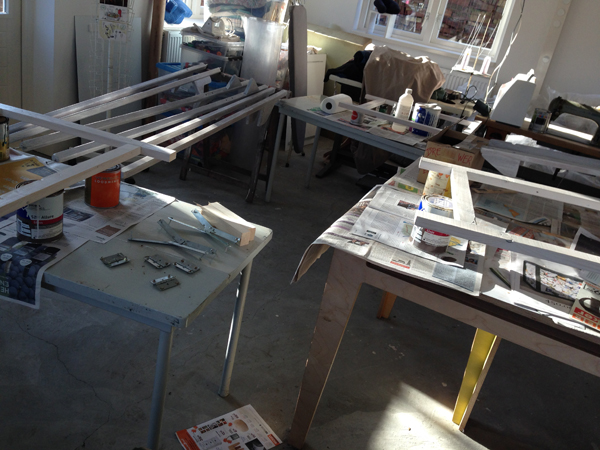
So my task for the coming days is to make a Curiosity colored trestle table and a set of Curiosity colored stilts. My studio doesn’t very often smell of turpentine – but today it did!
| « Opening | <-- previous post | next post --> | Malieveld tryout » |
|---|